This is a drawing that i did a couple of years ago. The assignment was realism which I’m normally very bad at. I chose to draw an eye using a photo reference(the one below) using the grid method to make it bigger. I spent days coloring this with colored pencils(ended up using some up) and created the highlights with a white gel pen. This is one of the few realism pieces that I’ve done, that I believe was successful.
Reference picture and link: https://rb.gy/jptptu
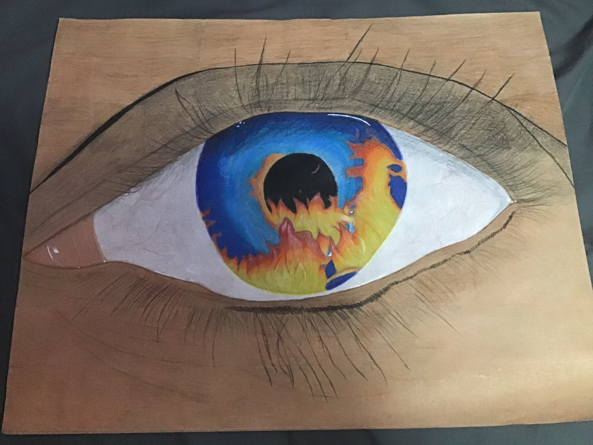

This is really good! I think the only critique I have is the blue in the eye and how its solid maybe you could have made it more soft. Although, I imagine you have gotten better in the past 2 years. Maybe you could try redoing this drawing and seeing how different it is.
ReplyDeletei agree with roman, going lighter on the eye wouldve make your art 10x better but this is really good art. -maddie
ReplyDeleteI am not a critic so i cant really tell you what you could have done better. But it looks good.
ReplyDeletei feel like this has a hidden meaning to it that i can’t fully grasp yet. the clash between ocean blue eyes and fire within them is brilliant.
ReplyDelete